If you’ve had your website up and running for more than a few months, you’ve probably noticed something curious. You’re getting some traffic, but almost none of that traffic converts into actual leads…
What gives?
Well, to some extent this is the nature of online marketing; only a small fraction of the people who visit your site will convert. C’est la vie right?
Wrong. In 2018 there is an entire industry dedicated to using design and functionality to increase the number of conversions on your site. It’s called Conversion Rate Optimization. Or CRO for short. CRO uses data and analytics to determine design, copy, and layout changes.
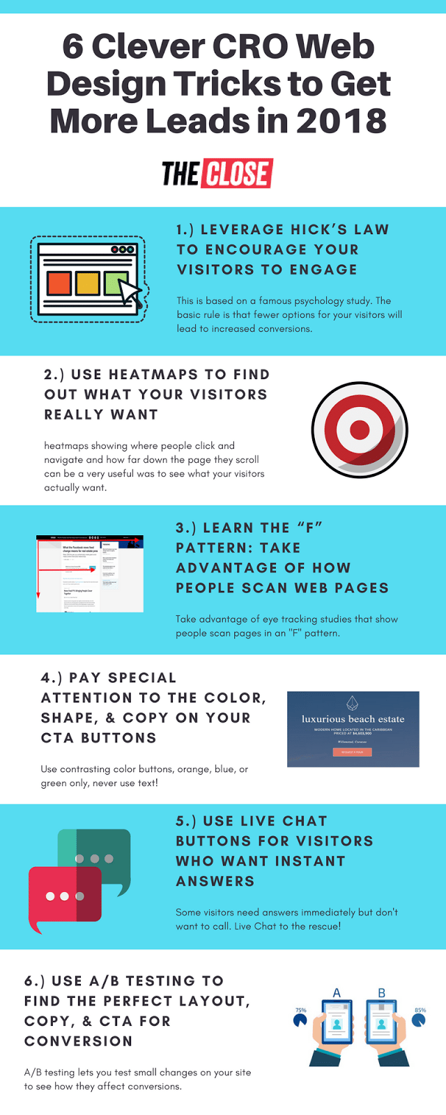
Today we’re going to look at 7 clever ways to apply CRO oriented design to your personal website, landing pages, or single property sites.
1. Leverage Hick’s Law to Encourage Your Visitors to Engage
Named for British Psychologist William Edmund Hick, this law states that the more choices a consumer has, the longer it will take them to make a decision.
In a study on decision making in supermarkets, Hick set up two sample displays of jam. One had 24 flavors, and the other had only six flavors of jam.
The results showed that 60% of people stopped and sampled jam from the table with 24 flavors. However, only 6% ended up purchasing a jar of jam.
Meanwhile, only 40% of people stopped to sample jam from the table with six flavors, but an astonishing 30% ended up purchasing jam.
Applying Hick’s Law to Your Site Design
The takeaway here should be obvious. By narrowing the number of choices your visitors have, you can dramatically increase your conversion rate.
In order to do this effectively, you need to take the time to figure out exactly what it is you want your visitors to do on each page of your site. For a landing page this might be obvious. You want them to fill out a form and give you their contact info.
For other pages on your site, the answer might not be so obvious. For example, what is the main thing you want visitors to do on your homepage? Do you want them to read the latest from your blog? Check out your brand new listings? Schedule a listing appointment?
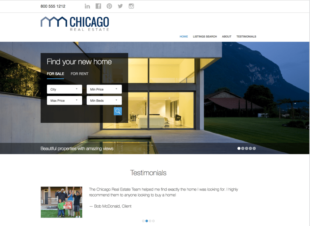
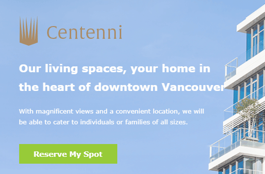
In order to get you thinking about this, it makes sense to check out the sites of some top producing Realtors for inspiration. To get you started, here is the main page for Los Angeles luxury brokers Williams & Williams:
Okay, I know. This is an extreme example from a team that has dozens of jaw dropping eight figure listings in Beverly Hills… Of course they’re going to encourage people to look at their listings first!
Let’s look at a site on the opposite end of the spectrum that still uses Hick’s Law. Check out the homepage for Placester’s free NAR websites:
The main choices here seem to be home search, and testimonials. Since these sites are all about generating buyer leads, this makes perfect sense.
For landing pages or home value sites, Hick’s Law is even clearer. In most cases you don’t even have the option to do anything besides enter your address and contact info.
2. Use Heatmaps to Find Out What Your Visitors Really Want
One of the trickiest things to do when designing your website or landing page is figuring out where your visitors are looking for information. Even if your layout and navigation seems obvious to you, it may not be obvious to all your visitors.
Luckily, there is a clever solution to this problem. Using heatmap software, you can track exactly where your site visitors are clicking and navigating. Here’s how it works:
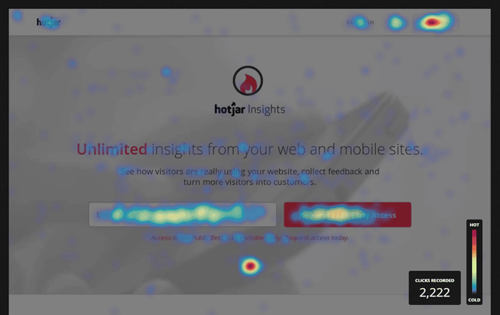
Sign up for a service like Crazy Egg or Hotjar and add pages from your site that you want to track. After a month or so, the software will create a heatmap showing an average of where all users navigated and clicked.
How Heatmap Software works: Heatmaps
Areas where users click or navigate to often are represented in red, while areas they click or navigate less are in yellow, green, and finally blue.
Using this data, you can tweak your layout, copy, and site colors to both improve efficient navigation, and subtly encourage your visitors to take a specific action. Depending on what you’ve decided that action is, this can mean signing up for an email list, entering their address, or browsing properties.
Here are a few common mistakes that heatmap software might uncover, and how you can fix them:
Problem
Your visitors are clicking on images or text that are not linked to anything
Solution
Consider moving your navigation, or CTA to the area they are clicking, or link the images or text in that area to a landing page or other relevant page on your site.
Problem
Visitors are navigating and clicking on too many areas of your page and ignoring what you want them to focus on
Solution
Keep Hick’s Law in mind and simplify your page’s layout to encourage them to click where you want them to
Image via Hotjar
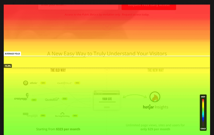
How Heatmap Software Works: Scroll Depth
Another useful metric that heatmap software can measure for you is scroll depth. This is the average “depth” a visitor scrolls down your page.
The same color codes used with heatmaps are used for scroll depth. Red areas are where the majority of users scroll down to. Going from red to orange, to yellow, and finally to blue where almost no visitor scrolls to.
Here’s what a scroll depth chart looks like using Hotjar:
As you can see, the percentage of site visitors who scroll down past “the fold” (the area of your website that is visible without scrolling) goes down dramatically toward the bottom of your site.
Scroll depth heatmaps can be a sobering wake up call for just how much of your website is never seen by your visitors. For example, on many pages, less than 10%(!!) of site visitors scroll down to the bottom of the page.
How to Use Scroll Depth data to Increase Conversions
The most common use for scroll depth data is for your blog posts. For example, if you have a post that’s more than say, 1,000 words, and less than 10% of your audience is getting to the end of the article, you need to make tweaks to get more people to finish the article.
Since longer articles do far better in search results than shorter articles, cutting down the length of your blog posts is not an ideal solution. Instead, break up the content of the article with images, graphs, and subheadings so people can skim the article.
People are busy and attention spans short. Letting your visitors skim an article and only read the subheading relevant to them will increase conversions.
3. Learn the “F” Pattern: Take Advantage of How People Scan Web Pages
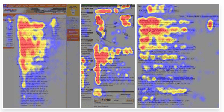
According to eye tracking research by Nielsen Norman Group, people scan web pages and phone screens in an ‘F” pattern; they start at the top left then scan right, then down, then to the right again, then to the bottom of the article.
It ends up looking something like this on a heatmap:
While the “F” pattern is not the only way people scan article or webpages, it is the most common.
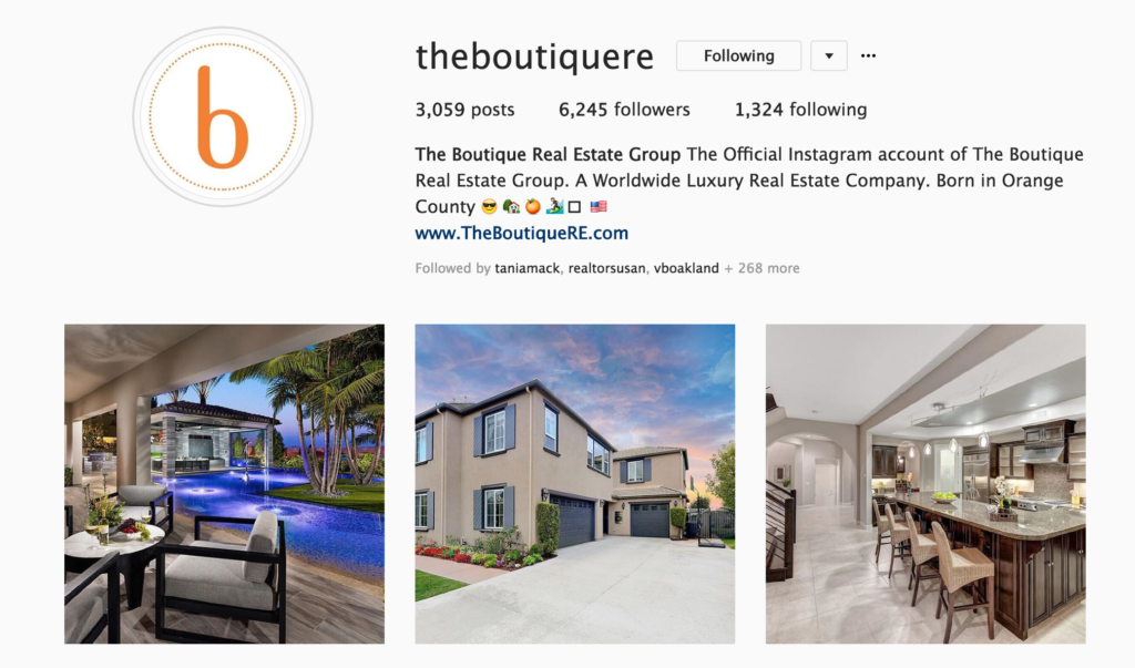
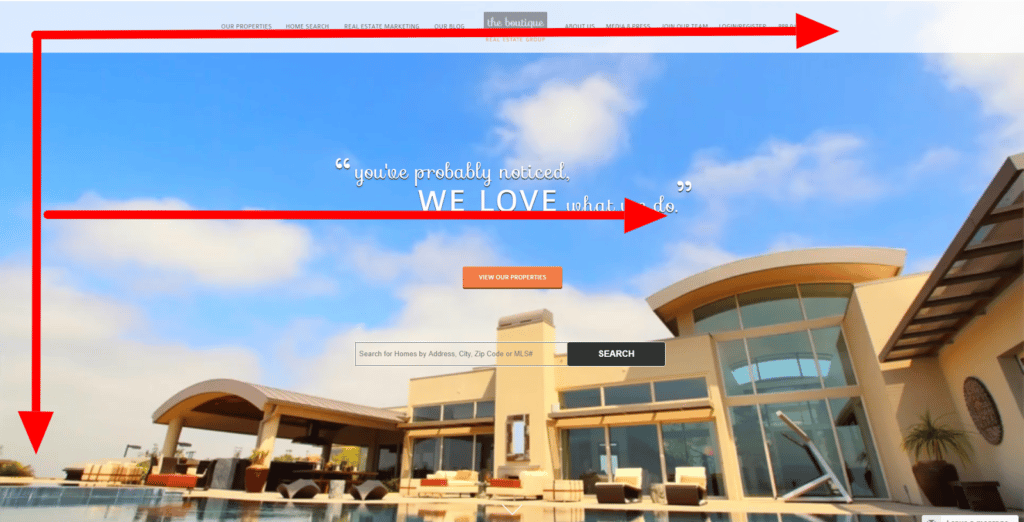
Here’s what a real estate homepage that utilizes the “F” pattern in its layout:
Screenshot: thebotiquere.com
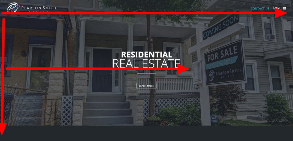
Here’s another:
Screenshot: pearsonsmithrealty.com
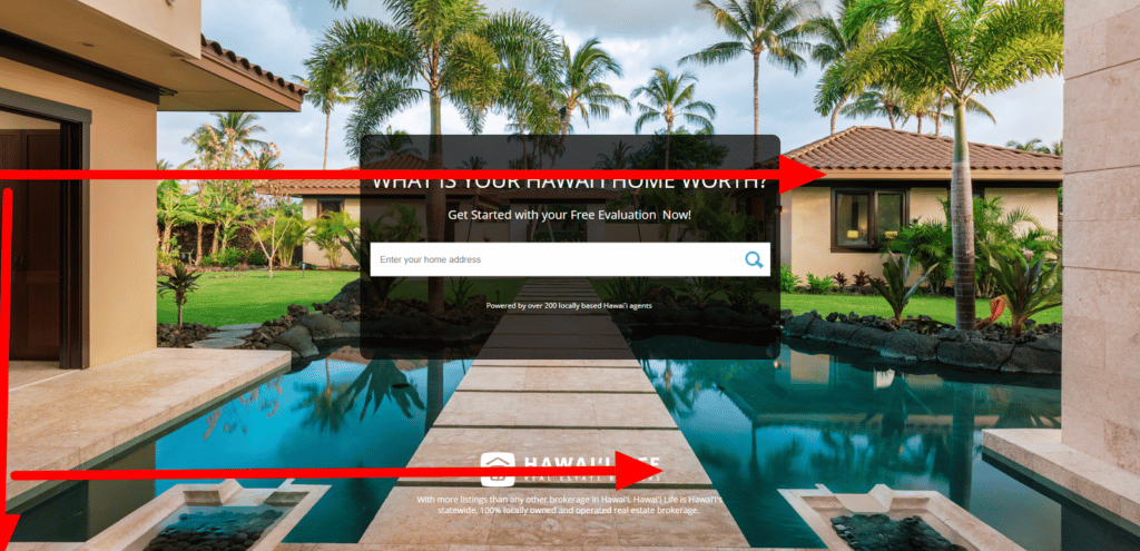
…and another:
Image via: labs.hawaiilife.com
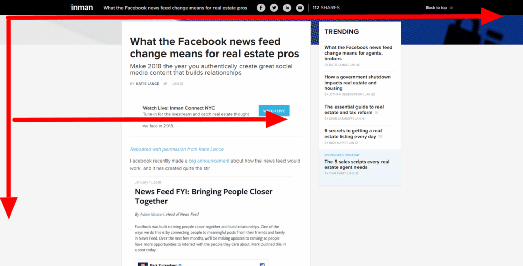
Here’s how you can take advantage of the “F” pattern on a blog post. Note where they’re placing the “Watch Live” button.
Screenshot via: inman.com
4. Make Sure Buttons and Text Boxes Are Easy to Use on Mobile
Is your website mobile friendly? If it’s not, there is a 100% chance you’re losing potential leads. According NAR’s 2017 Real Estate in a Digital Age Report 72% of home buyers used a mobile or tablet website or app in their home search. That’s a lot of lost leads…
Besides making sure the WordPress theme you’re using is responsive (aka works well on desktop and mobile) you need to pay special attention to buttons and text boxes.
In 2017, that means making your text boxes and buttons large enough even for people who are all thumbs to press. If you don’t, your leads may spend a few seconds trying in vain to get in touch with you then just give up.
Here are some of the buttons and text boxes you should pay special attention to on mobile:
- Call now buttons
- “Submit” buttons
- Personal information text boxes
- Page navigation buttons
- Drop down menus for property searches
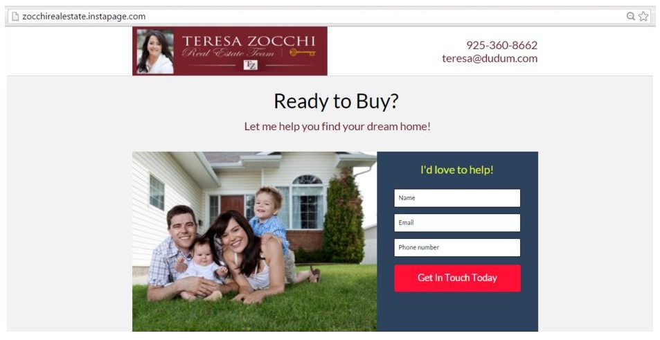
5. Pay Special Attention to the Color, Shape, & Copy on Your CTA Buttons
Believe it or not, even the buttons you use on your CTA’s can have a huge impact on your conversion rate. Subtle changes in color, shape, and copy on your buttons can mean more leads and more closed deals.
The only problem is that the digital marketing community just can’t seem to agree on what changes exactly lead to increased conversions. That said, there are still a few rules that most marketing and CRO experts can agree on:
- Orange, green, and blue buttons seem to convert the highest
- Buttons whose color contrasts well with the background color convert well
- They are actual buttons, not just text links!
- They use specific action words in their copy- “Get My Home Value” or “Download My Free PDF” will work better than “submit” or the dreaded “click here”
- They’re in a strategic place on the page- Think headline, short copy, text box, button. Also keep the “F” pattern in mind, as well as data from your heatmaps.
Here are some CTA button examples from Unbounce and Instapage that follow these principles well.
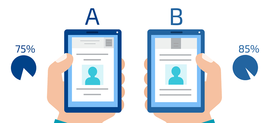
6. Use A/B Testing to Find the Perfect Layout, Copy, & CTA for Conversion
Okay, now that you’ve got some new CRO inspired design ideas for your website, the next step is to test them on you site. After all, there is no secret formula for conversion. Some changes or combinations of changes may work better or worse depending on a huge number of variables.
In order to find out which changes lead to better conversion rates, you need to use what the industry calls A/B testing (also known as Split Testing). Here’s how it works.
Whenever you make an edit to your layout, buttons, CTA’s or any copy, record your conversion rate and compare it to your previous conversion rate. In order to get a more accurate measurement, it helps to switch back and forth between changes more than once.
Once You’ve identified a change that leads to a higher conversion rate, then keep it and make another small change to the site and runt the same A/B testing. After a few iterations of this, your site should be fully optimized for conversion.
A/B Testing Landing Pages
If you’re trying to optimize your landing pages, then A/B testing is pretty easy. Most landing page software (Unbounce, Instapage etc) have built in A/B testing functionality.
The best thing about A/B testing with landing page software is that they serve up different versions of your landing page to different users. This is important to rule out factors like the day of the week or season that might affect conversion rates.
A/B Testing Other Pages on Your Website
If you’re not using landing page software like Unbounce, A/B testing your website is a little trickier. If you’re using WordPress, you can simply run one version of your page, record your conversion rate, then run the second version and compare the two.
Crazy Egg also offers an A/B testing platform, but you’ll have to shell out for their software to use it. With plans starting at $29 per month, it probably won’t break the bank, but manual A/B testing using WordPress edits is free. You just have to be careful about the time periods you test.
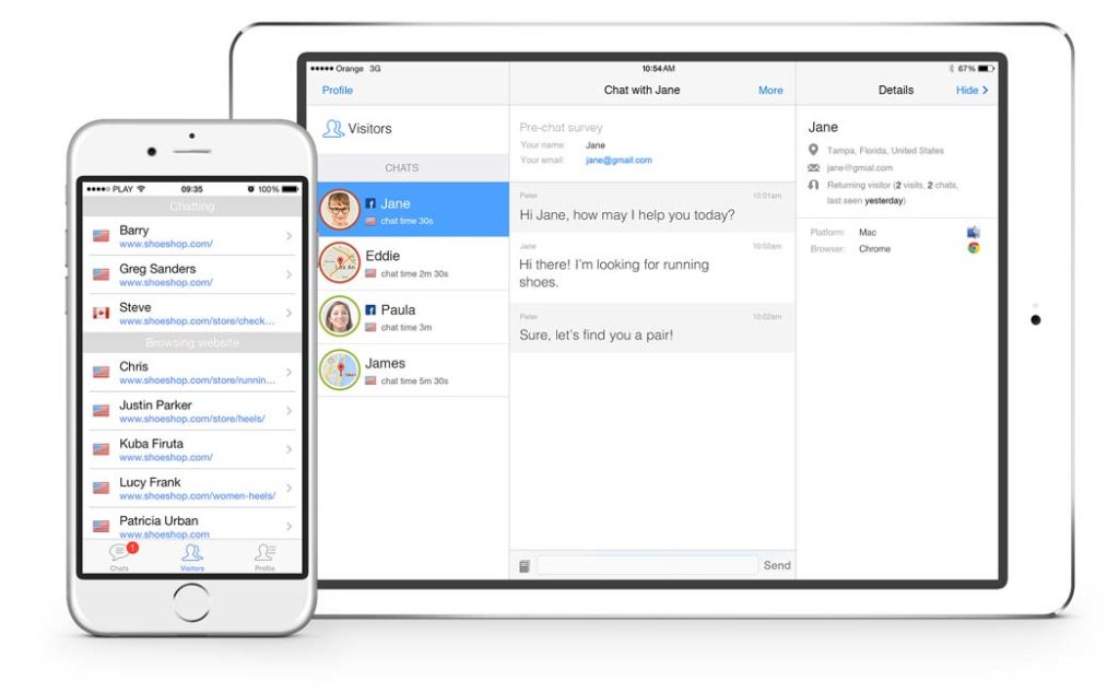
7. Use Live Chat Buttons for Visitors Who Want Instant Answers
There’s a funny paradox when it comes to lead generation. Some leads want to talk to you right away, but they don’t want to call you, and they don’t want to email… Short of sending a smoke signal, what else is there?
Enter the live chat button. Live chat buttons are small buttons that sit in the corner of your website and beckon your visitors to have their questions answered instantly. Of course some visitors will just waste your time, but some won’t…
While there are a lot of options on the market, the best live chat software will ping your phone and allow you to respond to live chat via text message. This way you can answer questions and ideally get them to call you while you’re on the go.
Real Estate Live Chat Options for 2018
Luckily, if you’re considering adding live chat to your website there are a ton of options on the market. Zendesk, LiveChat, Pure Chat, and Ready Chat are all solid options.
AI Chat Bots
Amazingly, some companies even offer programmable AI chat bots to interact with your site visitors and answer basic questions. Personally, I would avoid these solutions for now, as many of your visitors will be offended that you pawned them off on a robot…
The Bottom Line
If there’s one thing you do to your website in 2018, using CRO strategies to optimize for better lead conversion should be it. Pay attention to Hick’s Law, use heatmap software to track visitors, make sure buttons are easy to use on mobile, design them well, use live chat, and remember to A/B test your changes.